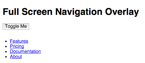
One current trend in navigation styles that you may have seen is the full screen navigation overlay. With this type of navigation, toggling the navigation will overlay the menu across the entire screen. Codrops did a really nice set of demos with full screen overlay styles last year. I wanted to demonstrate a very simple version of the overlay using jQuery. Of course, it's responsive as well, and you can view the demo on CodePen.
HTML
The HTML is easy. I have all of my content in a main wrapper, and my navigation in an aside. The navigation is a normal unordered list.
<aside>
  <div class="outer-close toggle-overlay">
    <a class="close"><span></span></a>
  </div>
  <nav>
    <ul>
      <li><a href="#!">Features</a></li>
      <li><a href="#!">Pricing</a></li>
      <li><a href="#!">Documentation</a></li>
      <li><a href="#!">About</a></li>
    </ul>
  </nav>
</aside>
For now, everything is visible, but we'll be using CSS and jQuery to hide and show the menu.
jQuery
The jQuery is even easier. As always, I prefer to define and call jQuery, and wrap the rest of my code within.
;(function($) {
  $(function() {
    // The rest of the code
  })
})(jQuery)
After that, I'll just be adding a click event to the toggle-overlay class, which will toggle open on the aside.
;(function($) {
  $(function() {
    $('.toggle-overlay').click(function() {
      $('aside').toggleClass('open')
    })
  })
})(jQuery)
CSS/SCSS
There's a bit more to the CSS, but the basic functionality is simple enough. This next line of CSS is all you need to make the code function, and from there you can add your own styles.
aside {
  position: fixed;
  width: 100%;
  height: 100%;
  top: 0;
  left: 0;
  background: linear-gradient(200deg, #27156e, #6a2a88, #9f4981);
  transition: all 0.5s ease;
  z-index: 2;
  opacity: 0;
  visibility: hidden;
}
.open {
  opacity: 1;
  visibility: visible;
}
My navigation is in the aside, but you can just as easily put it in a div, section, or whatever you want. Since I want it to take up the whole screen, I'm making it fixed with a width and height of 100%. Setting the top and left positions to 0 ensures that it takes up the whole space.
The background was my choice of a linear-gradient, but of course you can use anything. I've set a smooth transition, and a z-index of 2 to ensure that the content of the aside is always on top.
The next two lines are the only that change between states. aside is set to visibility: hidden and opacity: 0, and when the open class is applied, it becomes visible with full opacity.
Demo
Here is the demo of the code, with additional styles applied.
See the Pen yYrXRG.
Additional Styles
Close button
The close button is fixed, with a z-index of 3, just to ensure it always appears above the overlay. The span setup is the same as from the responsive dropdown navigation bar tutorial, except it's not animated. I find this method easier than loading a font icon set or using a unicode letter.
I'm using SCSS for these stylings, as nesting makes the code a lot more manageable.
.close {
  position: fixed;
  top: 40px;
  right: 60px;
  color: white;
  z-index: 3;
  cursor: pointer;
  font-family: sans-serif;
  span,
  span:before,
  span:after {
    border-radius: 4px;
    height: 5px;
    width: 35px;
    background: white;
    position: absolute;
    display: block;
    content: '';
  }
  span {
    background: transparent;
  }
  span:before {
    transform: rotate(45deg);
  }
  span:after {
    transform: rotate(-45deg);
  }
}
Unordered list menu using flexbox
To ensure that my menu looks good no matter the size of the viewport, I'm using the flex property. The nav tag is my flex container.
I declare a flex container with display: flex. By setting the flex-direction to column, I'm ensuring that the content is stacking vertically. justify-content will ensure that anything nested inside of the flex container will be vertically aligned. I've set the height to 95vh, which is 95% of the viewport height.
nav {
	text-align: center;
	height: 95vh;
	display: flex;
	flex-direction: column;
	justify-content: center;
Any time you use an unordered list for a menu, you'll be removing the list-style and extra space.
ul {
	margin: 0;
	padding: 0;
	list-style: none;
The lis inside the navigation are the nested flex items. I've set them to have a line-height of 20vh to ensure they're centered vertically. I set it to 95/20 instead of 100/25 to give a little extra room.
li {
	align-items: center;
	flex: 1;
	line-height: 20vh;
The a is a block-level element, with a transition. I've set the font-size to 1.5em for mobile, but also added a min-width media query to increase the font size on desktop.
a {
	font-size: 1.5em;
	transition: all 0.5s ease;
	display: block;
	text-decoration: none;
	color: rgba(255, 255, 255, .5);
The final bit of code I have adds an animated underline to the a elements. This effect is inspired by Tobias Ahlin's "Animating Link Underlines" article. Here's the completed menu code.
nav {
  text-align: center;
  height: 95vh;
  display: flex;
  flex-direction: column;
  justify-content: center;
  ul {
    margin: 0;
    padding: 0;
    list-style: none;
    li {
      align-items: center;
      flex: 1;
      line-height: 20vh;
      a {
        font-size: 1.5em;
        transition: all 0.5s ease;
        display: block;
        text-decoration: none;
        color: rgba(255, 255, 255, 0.5);
        &:hover {
          color: rgba(255, 255, 255, 0.9);
          transform: scale(1.1);
          &:before {
            visibility: visible;
            transform: scaleX(1);
          }
        }
        &:before {
          content: '';
          position: absolute;
          width: 50%;
          height: 2px;
          bottom: 0;
          left: 25%;
          background: white;
          visibility: hidden;
          transform: scaleX(0);
          transition: all 0.3s ease-in-out 0s;
        }
      }
    }
  }
}
@media screen and (min-width: 600px) {
  nav ul li a {
    font-size: 3em;
  }
}
In order to ensure the span is large enough to register a click event on mobile, we also have to use the outer-close class to create a larger area.
.outer-close {
  position: absolute;
  right: 0;
  top: 0;
  width: 85px;
  height: 85px;
  cursor: pointer;
}
I hope this simple bit of code inspires some possibilities for creative full screen overlay styles for you.
